The Wonderful World of Color
Color is a powerful tool in interior design and when staging real estate properties. It can make a feature pop, provide continuity, and affect mood. The use of color should be deliberate and well thought out.
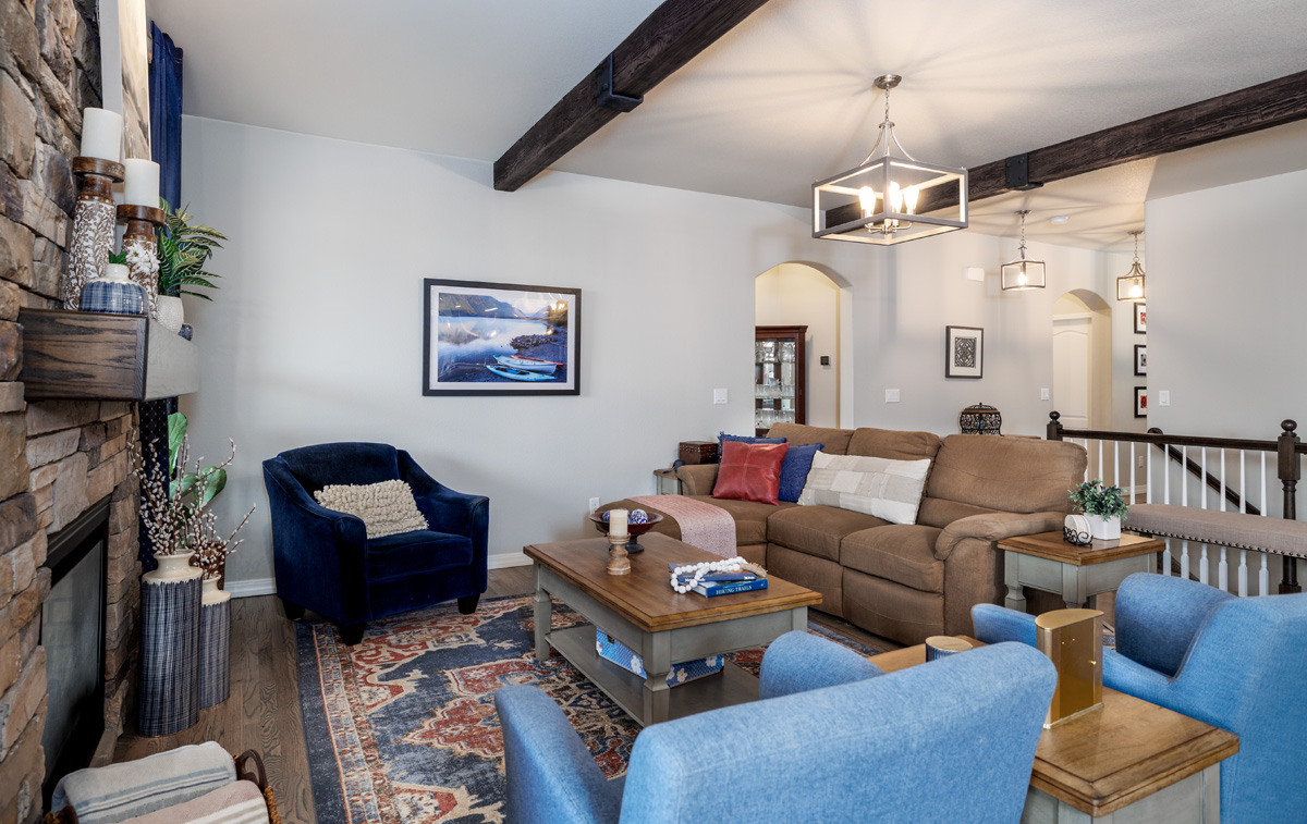
Once when decorating my own home, I was choosing between two different drapery fabrics. The small swatches both looked nice next to the stone fireplace. The natural stone clearly had traces of both colors throughout its earthtone palette. However, when I held up larger pieces of both fabrics something astonishing happened. The dark blue fabric made the fireplace come alive. All the rich tones stood out better than they did on their own. In contrast, the cranberry red fabric muted the rest of the tones making the fireplace appear drab. One color commanded your attention, while the other color pushed you away. Framing the fireplace with the dark blue fabric made the fireplace the focal point of the room.
The right color, when used properly, can be used to draw the eye to unique selling features of a home. Color can also be used to pull the eye away from a design feature. Through experience and a keen eye, you can begin to pickup on the best color choices to use in a situation. A realtor can always use the failsafe method of swapping out several pillows or pieces of wall art to see what works best.
Harmony in design can also be achieved through color. I find that this gives the home an overall sense of peace and calm. You start with a color palette. It usually consists of two main colors and a few complementary colors. In the great room, you decorate with the main colors. In adjacent rooms, you can choose to use a singular main color, or pick one of the complementary colors and bring in one of the main colors in a supporting role. In my home, I decorated the master bedroom in a light blue tone that was in the same family of blues as the living room drapes. The office was done in a rich olive-green tone with blue fibers present in the chair fabric.
You should also consider how a color makes you feel when selecting colors for your home. When you spend a lot of time in a space, you want to choose colors that relax you. Blue has a calming effect. That is why it is a mainstay color for many top designers. It is one of the more popular painted cabinet colors often used in contrast to white. I regularly use blue in home staging because I want to generate a feeling of “home.” I want a buyer to be comfortable kicking off their shoes and staying awhile.
Fire engine red, on the other hand, gets your heart rate up. It should be used strategically to generate excitement around special features of a property or create moods within a space. Other shades of red, like burgundy, can be used to draw the eye but provide more warmth to the space.
Green is natural and can make a place feel alive and cheerful. It is found everywhere in nature from the tall trees to a small blade of grass. I like to choose greens that are trending to modernize a space. Of course, the spectrum is endless, from the classy jade tones to the rich forest greens you can’t really go wrong. Plants are a great way to bring green into a space, while not straying from a color palette. I like to use artificial plants in staging because they always appear fresh. It’s a great way to bring a little bit of the outdoors inside.
The impact of color is an important consideration for a realtor as part of the overall marketing approach for a property. Once you have identified the selling features of the home, you can use color to accentuate them. Color can also be used to maintain a natural flow throughout the tour. And of course, the ultimate goal of a realtor is to create an emotional connection between the buyer and a listing. Color is a key factor in achieving these strategies.